Why I Heart Roy Crane
Roy Crane’s Art
Look at this:
This is Buz Sawyer, an adventure comics strip by Roy Crane. This one’s from 1946. Buz Sawyer is headed to Greenland to find out what’s going on with a branch of the oil company he works for.
Roy Crane began his career in 1924 with a strip called led Wash Tubbs. 22 years later, he’d refined his style and become one of the most realistic artists working in comics –not in his people, who always kept a cartoony, exaggerated style, but in his landscapes and vehicles. This short sequence shows perfectly how he used all his talents to build a sense of grandeur and danger. He was well-travelled, and before he tackled a new location, he either visited it himself or did extensive research.
This grayscale is done on Craftint paper, a short-lived method of reproducing clean grays for newsprint. The paper was sold with chemicals. Each chemical brushed on to the paper would produce a different set of gray crosshatching. Roy Crane is the only artist I know of who really mastered the use of the technology.
I don’t know of any other artist who would use one wide, mostly white panel to illustrate the weird emptiness of flying over ice fields, then follow it up the next day with more scenery, a little more detailed, but still simple and bold. That’s a risk in newspaper comics, where characters and cliffhangers take precedence, and drawing out descriptions can lose readership. It must have been terrible to read this one strip at a time. Collected, they gain a lot of power.
Roy Crane used scenery to evoke mood and a strong sense of place. It’s easy to feel the heat and the danger of this Florida swamp on fire:
Or the romance in the air here in San Felipe:
Roy Crane’s Captions
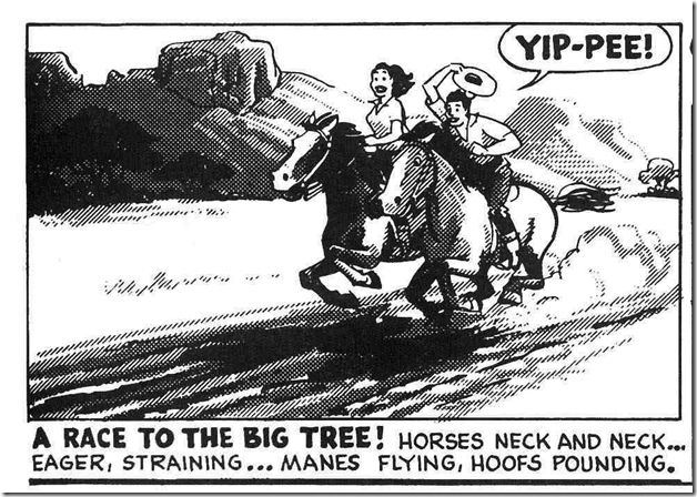
No one ever used captions the way Roy Crane did. They can be poetic and descriptive, like the ones above, or breathless and fraught.
He loved to set the tone with a shouted fragment… “Disaster!” “Racing Horses!” Then carry on with complete sentences or ragged adjectives to fill the panels with mood.
Often, the caption and the panel told the same story, but in slightly different ways. The combination of image and poetic description brought a power and melodrama to his storytelling that other artists just didn’t produce. In the “Racing Horses” panel, we can see clearly the danger Christy is in, we can understand where everything is and get a sense of how cold the stream is and what kind of weather we’re having, while the words breathe a kind of continuity into the image, letting us know how the accident happened and that she’s been lying there for a few moments too many.
Captions like these seem too melodramatic for today’s comics, but I love them, and I use them anyway.
There’s more. I love Roy Crane for the bad guys, the beautiful girls, the diversity of locales, and the range of stories. His strips ran well into the 80’s even after he died in 1977. Over 60 years of making comics, Crane sent his various heroes to contemporary Saudi Arabia, Pacific islands, small-town America, New York, deserts, jungles, revolutions, fueds, and kidnappings. He told all kinds of stories, from petty infatuation dramas to terrifying pirate escapes.
Reprints are available from Fantagraphics and NBM, but they go in and out of publication. I usually buy a few copies of the collected works when I can find them for decent prices.
Roy Crane. One of the top three influencers on my work.


